In middle school, while others played wall ball, I taught myself basic HTML. I was one of the kids staying inside during recess, because the internet was calling to me. I built countless websites on Geocities and Angelfire, peppering them with visually-painful neon colors, blinking text, and weirdo fonts. If I was feeling particularly saucy, maybe an embedded MIDI file that belted out a crude “Desperado.”
The cool thing about that time period is that literally nobody was looking at what I was doing on the internet.
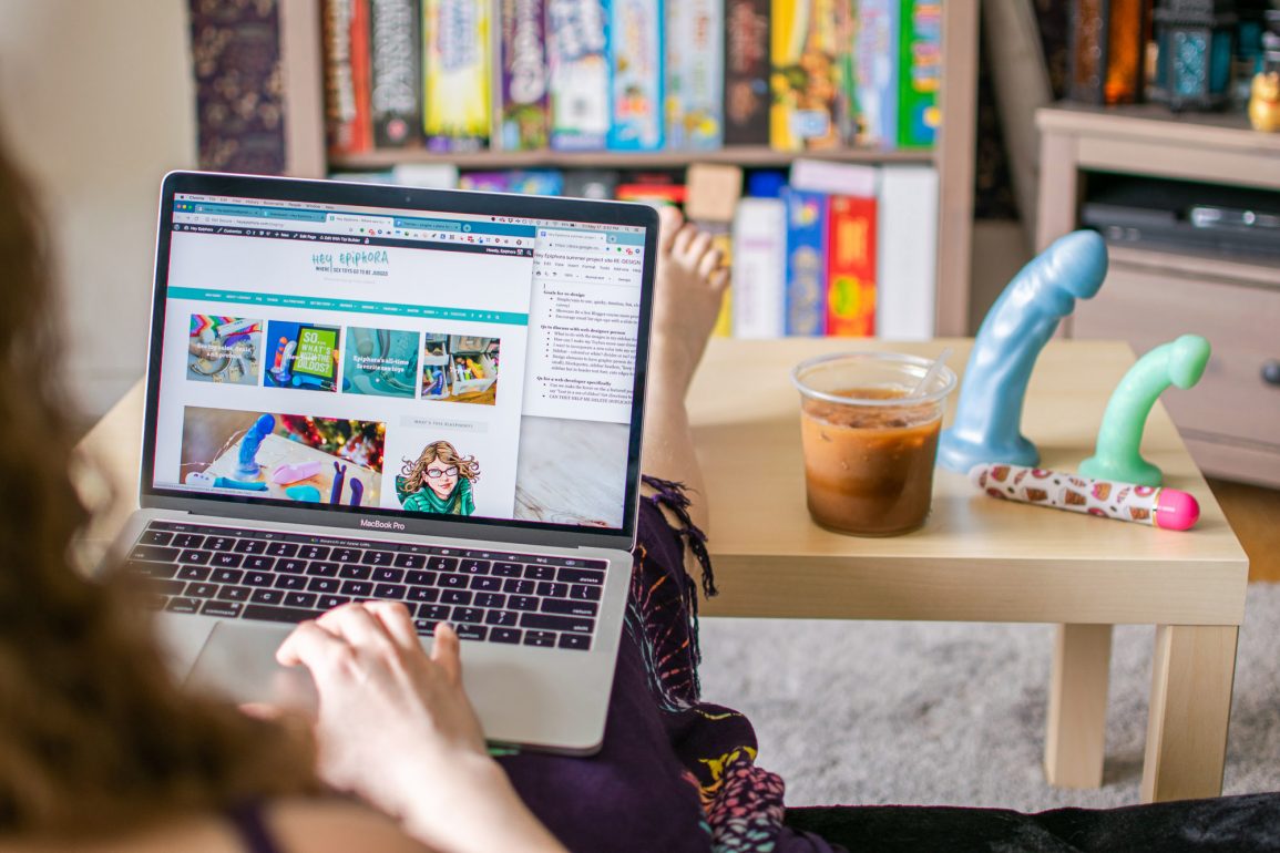
I of course parlayed that field experience later in life with this blog, teaching myself more technical skills along the way, like CSS and how to wrangle WordPress. It’s served me well, for the most part, but I’ve focused mainly on writing new posts, learning to take decent photos, and being a hoot on social media. My site’s design, meanwhile, has evolved less.
After all, I realized, it’s hard to get excited to write when I don’t even like how my posts look when they’re published.
That was fine at first, but it’s an issue now. I’ve had roughly the same blog design since I went self-hosted in 2009, and you can tell. I’ve tweaked it plenty over the years to add functionality, but the basic structure remains — and it’s a limiting, outdated one. I’ve been low-key embarrassed about how my site looks for years, but I kept putting it off, thinking, ugh, I don’t have time to overhaul the entire thing right now. And that’s what it needs: a total gutting.
Related reading
Last week, though, I had a bit of a realization with my therapist. I could take a hiatus from blogging — or simply post less often — to focus on making the re-design everything I want it to be. She kinda had to talk me into the idea, but she had a good point: it’s summer, the slow season, people will be out having lives. Why couldn’t I have one too? Give myself enough time to really execute my ideas well?
I knew it was the right thing to do because of how fucking pumped I felt after therapy that day. I was bursting with ideas, like 13-year-old me securing a sweet Geocities URL. Yes, I’d consumed several shots of espresso, but it was still quite the contrast against the general burnout and anxiety I’ve been feeling lately. After all, I realized, it’s hard to get excited to write when I don’t even like how my posts look when they’re published.
As a recovering perfectionist, this is the challenge of my life. I’ve found myself doing shit like googling “web design trends 2019” and it’s not okay. Kynan reminded me that fads come and go, and chasing them isn’t worth it. He’s right, but I do worry. I worry about being relevant and cool, and I desperately want my blog to be more modern.
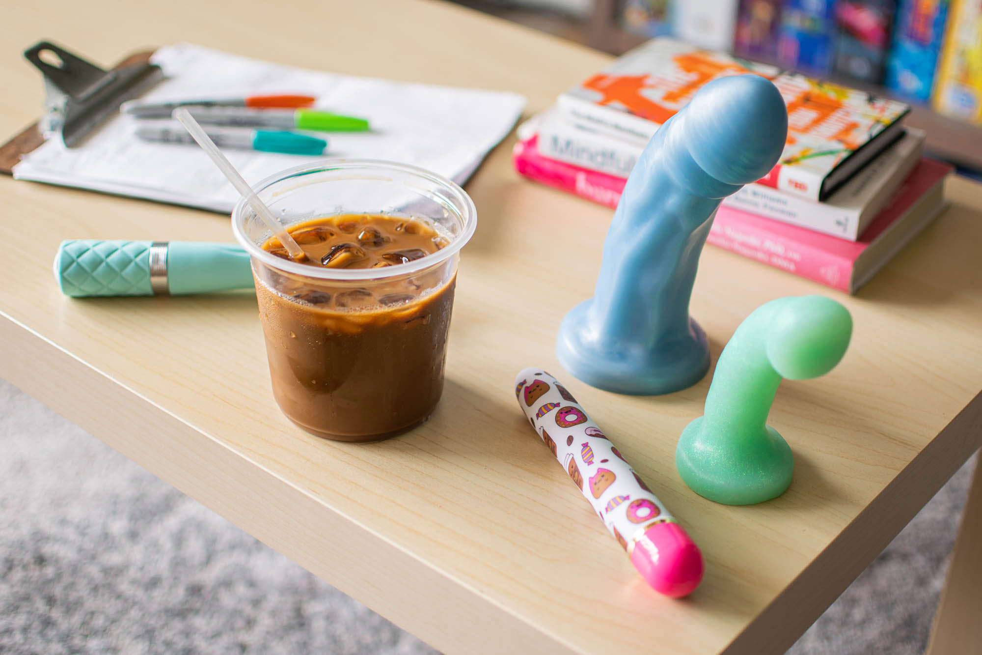
Left to right: Sassy, Sweet Rush, Splendid (large), Trinket.
Sifting through WordPress themes has reminded me of how, well, old I am. I remember when rounded corners were the tits — you wouldn’t be caught dead with jagged square edges on your images. I remember when mobile design was an afterthought and theme flexibility meant being able to change the color of your links. Features I only dreamed of having on my website years ago, such as a lightning-fast real-time search and enticing mega menu, are now standard on most blog themes.
I have a wishlist five miles long of blog features, and I intend to get most, if not all, of what I want. My main goal with the new design: making the homepage a place you want to stay. I want to show off new content and spotlight old posts too, making it more welcoming to new readers and more interesting for old ones. I also want to overhaul my sidebar (I’ve already moved my blogroll to its own page!) and customize category and tag pages to make archive-diving more enjoyable. The site will finally be mobile-responsive, and dear god, I hope, faster.
The question of fonts is an important one. When I designed this site, Trebuchet MS was one of the more lively of my font options, because we were limited to the fonts people already had on their computers. Now, we can use virtually any font we desire. Tasked with finding the perfect font for my writing, I am overwhelmed with choice. Look, all I want is something readable yet unique, with the right kind of ampersands and Es and question marks and correct curvature of apostrophes. Is that so much to ask?!
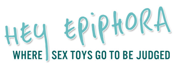
My “logo” is another complicated matter. I’ve never had one, really — it’s always just been “Hey Epiphora” in that particular font. I’m torn between keeping it for its association with my brand, or scrapping it for something new entirely. I have no idea which aspects of my brand are quintessential, except maybe my color scheme, which I intend to keep — but diversify. (I might get wild and add an orange or something. Anaranjado, bitches.)
As I spend the summer working on my site re-design, posts are going to be more sporadic. I plan to take the opportunity to work on myself, too: by reading Burnout and Mindfulness, learning to meditate. Going to the doctor. Weeding my yard. Trying to eat breakfast, drink water, believe in myself and all that shit. I’m dreaming big.
I’ll also be attending the sex toy trade show ANME in July, thanks to the generosity of SheVibe! I’ve never been before, strangely enough. In addition to squeezing every new dildo and finally meeting various sex toy company reps in person, I’ll be participating in a special influencers meeting with Velvet Thruster and some fellow bloggers. Very very excited about that! Keep up with all my antics, as usual, on my social media accounts.
So if there’s something you need me to know about the design of my site, speak now or forever hold your dildos. And reassure me you’ll still be here when I’m done, because my brain is telling me this is risky to my business even if the payoff could be grand. At summer’s end, I hope to present to you a fancier, sleeker, totally spruced up Hey Epiphora.
Wanna give me input on my new site design?
Thank you! I’ve written some specific questions here, but I’m open to any input you might have about my design, as long as it’s kind.
- Which modern web design elements do you love? Hate?
- When you want to browse old content on my site, how do you find it? How can I make this process easier and more fun?
- Do you know any awesome graphic designers, brand consultants, and/or web designers I should consider hiring? Hell, I’ll even take recommendations on straight-up artists if you think their style might fit.
- Do you associate the handwritten font in my header with my “brand” enough that I should keep it? What else do you associate with my brand?
- What do you look for in the mobile version of a blog?
- Should I keep the superhero version of me as my avatar, or take an actual photo of myself?
- Do you use these things when they are present on a blog: tag cloud? Social media sharing buttons? What do you think of sites that load another post after the one you’ve just read — useful or rude?
- Which other blogs do you read? What aspects of their site designs do you appreciate? Can you show me the queer blogs because I don’t know how to escape the straight girl food/fashion/lifestyle blog world?!
- Might you be interested in beta-testing the design in a few months? Shoot me an email if so!
